


The Indigo Spa Co. BRANDING | 2016
This branding project brought a local spa to new life under a transfer of ownership. Changing the name and style of the spa from the previous owners, the new owners wanted their logo and brand identity to reflect a fresh take on their space. It was important to reopen as an entirely new company, with an identity that was truly their own.
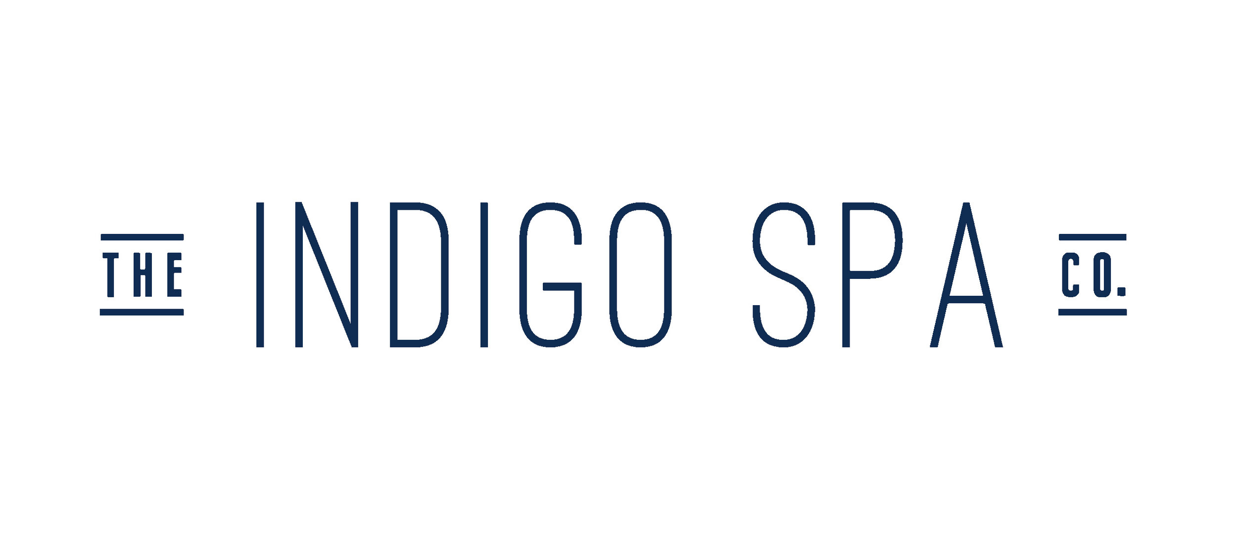
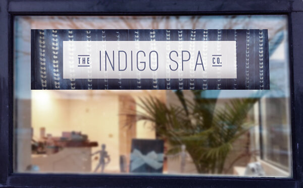
The new owners wanted their branding to not only reflect their core identity as a company, but also pair well with the modern industrial-chic interior of the spa, which they were renovating in partnership with a local interior designer. The Indigo Spa Co. is located in the heart of New Bedford, Massachusetts’ Downtown scene in a renovated brick building that fits right in with the character of the remodeled mill buildings and growing local artisan community. The logotype was inspired by the industrial modern aesthetic, balanced with an openness to reflect the feelings of welcome, openness, and cleanliness within the spa.
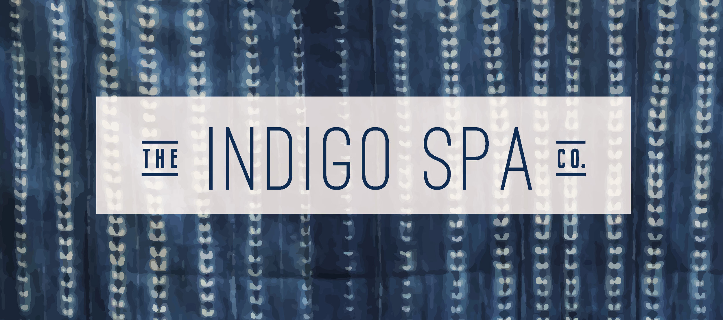
The spiritual and natural properties associated with the indigo plant and the color of the dye that comes from it are essential to the core of the Indigo Spa Co.’s identity, so naturally indigo became a focus for the brand identity. The color palette and textural motif were directly inspired by traditional, hand-dyed, indigo Shibori fabrics. The imperfect nature of the pattern reminds us that in the beauty of hand-dyed textiles there is evidence of the human hand at work. Since the spa services work to comfort and heal, in large part through the work of human hands, this connection is an unspoken symbol of the human aspect that is so important to the company.